Self-scan for the many
Redesign of the IKEA self-scan check-outs.
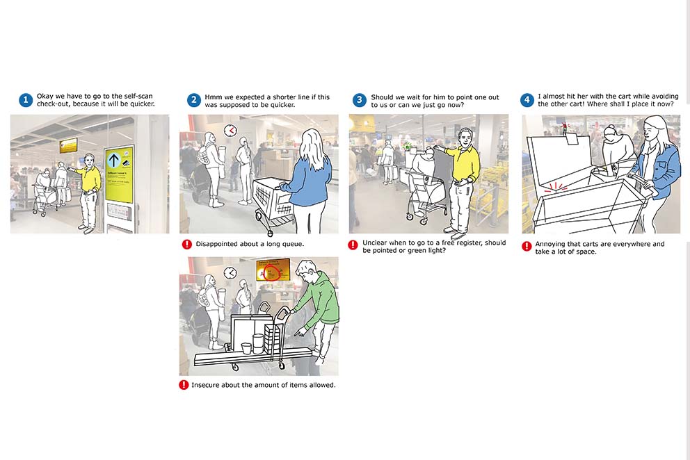
Customer Journey map, Storyboard, Prototyping, Usability testing.
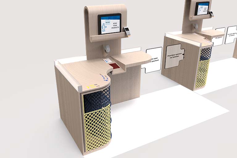
The self-scan check-outs are an important part of the IKEA experience. Before grabbing a one euro hotdog on the way out, the self-scan check-out can be the last experience of a customer. They allow the customers to remain in control by completing the check-out process by themselves. The redesign of the self-scan check-outs at IKEA Delft aims to provide autonomy, confidence and satisfaction to its users.
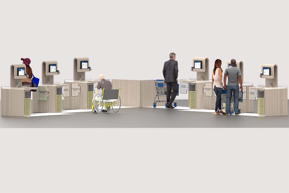
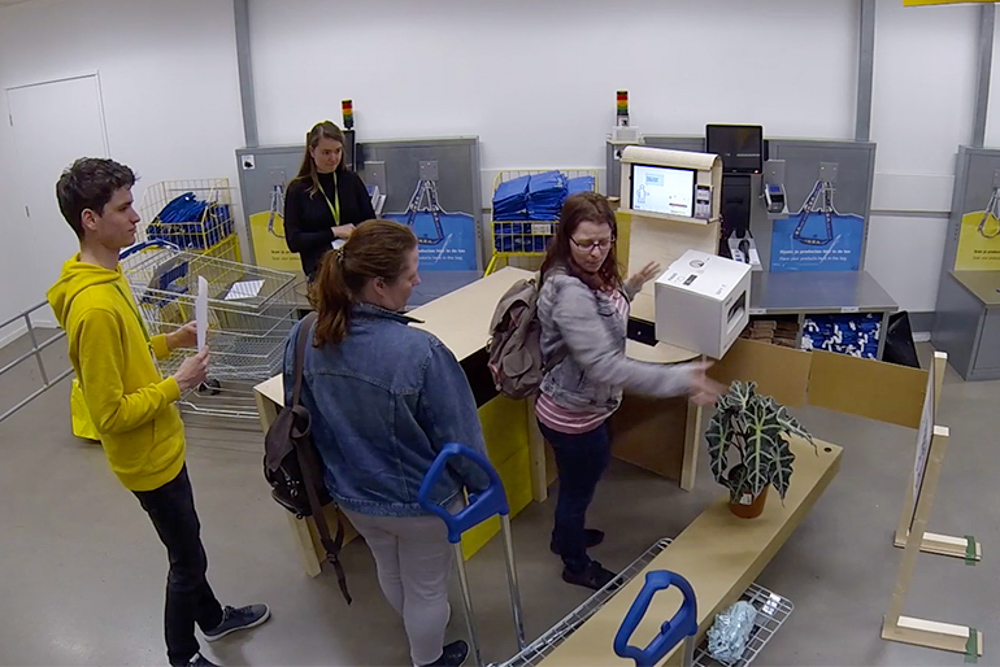
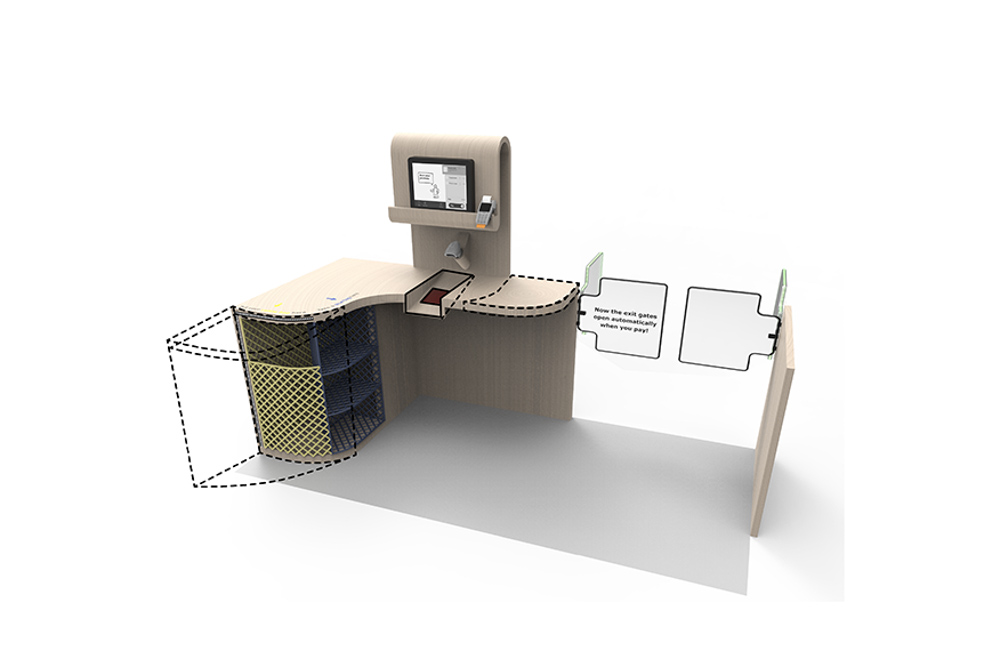
The final model provides a private space for every customer. It allows for freedom to fulfill tasks as they please, by providing enough counter space and two ways of scanning their products. The architecture of the counter guides the customers through an ideal check-out process, yet allows for freedom to perform the tasks as they please. To do so the counter offers lots of space and two ways of scanning their products. After payment the autonomous feeling concludes thanks to a private exit opening without the use of a receipt.
Learnings
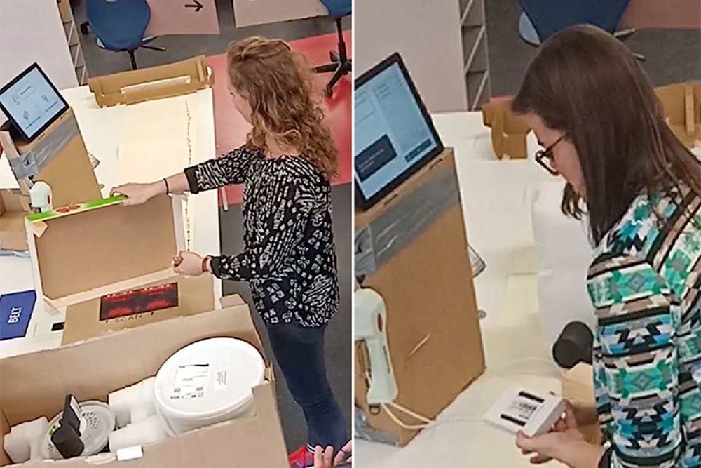
- Talking about a concept after testing a concept was made easier by having different pictures and drawings of the concept for the participant to point at during explanations.
- Usage of multiple observers during user testing brought interesting discussions afterwards when concluding the results.
- Testing the final concept with customers at the location itself raised the test to a very realistic level, but made us deal with the influence on the participants of bystanders watching.
Credits
This project was executed together with Zimeng He, Corné van den Brink, Floor van Gent and Ane de la Brena Garcia. During this project we had rotating roles of project leader, management and reporting. Besides these diverse roles I was responsible to analyse the results of the concept test and translate that into a new concept.
Hi there!
Collaborate?
Interested to know more about a project?
Cup of tea?
Shoot me an email!
